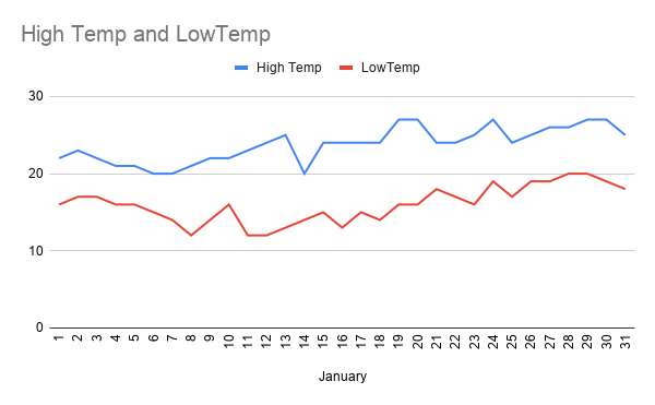
In Room 8 St Patrick's school learned how to use Graphs in Google sheets. Graphs are like diagrams. This graph or diagram shows the high and the low temperatures during the month of January. The numbers on the bottom are the dates, and the numbers on the sides show the temperatures. I also learned how to put data into a google sheet.
Hi Augustine, I Aleenah is commenting on your math graph of the temperatures in January. Was it easy making a line graph from scratch? Even though this looks great! The data is very clear and you had a description of the making and what you've learnt. Great job and keep learning!
ReplyDeleteKind Regards, Aleenah
NO it wasn't
DeleteHi Augustine i really like how you made your line graph. Great job keep it up.
ReplyDeleteHello Augustine.
ReplyDeleteI really liked your line graph. How did you make this line graph? its really great !. Keep It Up Bro